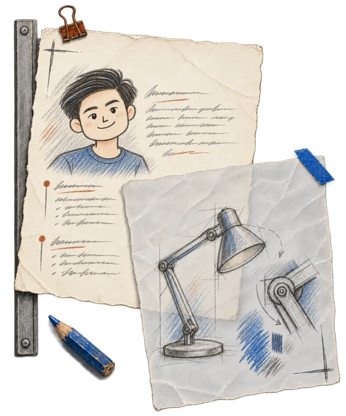
Several screen designs look right. Which one do we build?
Several screens can look right at first glance. Choosing one, then looking closer, gives a design handoff a much clearer starting point.
In short
Open a design link and several screens may look almost right. Using an older recruitment dashboard from Navigos Talent One, I show what goes wrong when an AI coding assistant mixes pieces from similar screens, and how Figma Lens, which I made, helps it choose one and read its chart and table up close. If you hand over designs, point to the intended screen and the part that matters.
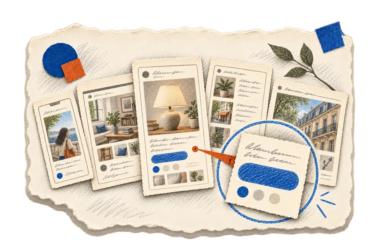
Someone sends you a design link, and when you open it you find a small neighborhood of screens. Several of them look almost the same: one has an empty table, another shows results, a third has a message above a button, and the phone version sits further down the page. Before anyone writes code, someone has to work out which of these versions is the one to build, and that takes a different kind of attention from the building itself.
A coding agent, an AI assistant that can read and change code, can skip that step without noticing. It may start making the page before it has settled on a screen, borrowing a button from one version and a message from another. Every piece it picks up belongs somewhere in the file, yet the page it assembles matches none of the versions in it.
I made Figma Lens so that an agent settles that question first. Figma is where teams arrange and share interface designs, and Lens gives an agent a way to look around a Figma file, choose one screen, examine that screen's parts at a size where the details are readable, and keep it as the reference for checking the page once it is built. It works a little like cooking from a recipe spread across several sheets: before measuring anything, you want to know which version you are cooking, because a note from a different version may be perfectly readable and still send dinner in the wrong direction.
When the agent opens the dashboard design
The example I use to explain the process is an older recruitment dashboard from Navigos Talent One. The dashboard belongs to a product built by a team, and I borrow its design here only to walk through the steps. The page brings together summary cards, a chart and a table of open jobs, so looking at it whole first helps establish where each of those pieces belongs, and selecting its content area then gives every later step of the inspection one shared reference.
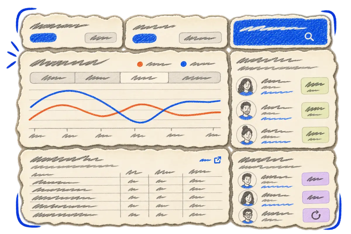
Once that screen is selected, the questions about the request become much easier to ask: which part changes, what needs to stay, and whether the request concerns the table or the control above it. For each answer the agent now has one specific place to look, instead of a whole file of near matches.
When the chart and the table need a closer look
Seen from a distance, the selected page shows its arrangement, but the small labels disappear into the shape of the chart, and enlarging that small image afterward cannot recover detail that was never there. Lens can extract the chart separately at a useful size, which makes the legend and the time controls readable.
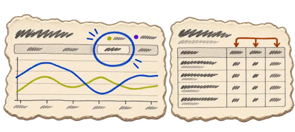
A close view of the jobs table reveals a different set of decisions: titles need space, the counts have separate meanings, and expiry dates belong in their own column. These are ordinary details, and they are easy to miss when the whole screen is treated as a single picture. Giving one part room lets the agent work from what is visible instead of filling the gaps with something that only looks plausible.
When the built page opens in the browser
I want the chosen screen to stay useful after the code is written, because it should help check the result as well as start it. Two separate checks happen here, one asking whether the words on the page match the selected design and the other asking whether the page looks right when it runs. They catch different problems, since a button can have the correct label and still have awkward spacing, and a tidy dashboard can contain a number taken from a different state.
Lens includes a copy check for the first question. The second needs the agent to open the application, look at how it renders and compare that with the reference. Fonts belong in this second check: a design can name a font the website has never loaded, and substituting another one may change a line break and push the rest of the page down, so the agent needs to check the resulting layout in the browser after building. The harness story explains how the reference stays with a task as it moves between tools.
How I work on Figma Lens, and where you can start
I lead Figma Lens's development, which means I define the inspection sequence and the instructions agents follow to select a screen and examine its details. Coding agents produced much of the tool's implementation, so my part is reviewing their code changes and testing the workflow to check whether an agent actually follows those steps, then revising the tool or its instructions where needed.
If you are the one handing over a design, the same habit gives whoever receives it a concrete place to begin: point to the intended screen, identify the part that matters and keep that reference available for review, so fewer decisions stay hidden inside a link.
More about the inspection workflow
Figma Lens can return measurements and text styles, export selected assets and provide focused renders. Its design-to-code guide describes choosing a visible baseline before implementation and checking both copy and rendering afterward. The agent needs image-viewing support and must actually open the returned evidence. Font availability and licensing still belong to the destination application.